


The data professions (data science, analysis, engineering, etc.) are highly technical fields, and much online discussion (in particular, on this blog!), conference presentations and classes focus on technical aspects of data work or on the results of data analyses. These discussions are necessary for teaching important aspects of the data trade, but they often ignore the fact that data and analytics work takes place in an interpersonal and organizational context.
In this blog post, the first of a series, we’ll present a selection of non-technical but common issues that data professionals face in organizations. We will offer a diagnosis of “why” such problems arise and present some potential solutions.
We aim to contribute to the online data discourse by broadening the discussion to non-technical but important challenges to getting data work done, and to normalize the idea that, despite the decade-long hype around data, the day-to-day work is filled with common interpersonal and organizational challenges.
This blog post is based on a talk given by myself and Cesar Legendre at the 2024 meeting of the Royal Statistical Society of Belgium in Brussels.
In this first blog post, we will focus on problems that can occur when communicating to organizational stakeholders (colleagues, bosses, top management) about data topics.
Below, we present a series of short case studies illustrating a problem or challenge we have seen first-hand. We describe what happened, the reaction from organizational stakeholders or clients, a diagnosis of the underlying issue, and offer potential solutions for solving the problem or avoiding it in the first place.
Case 1: The Graph Was Too Complicated
What Happened
- In a meeting among the data science team and top management, a data scientist showed a graph that was too complicated. We have all seen this type of graph - there are too many data points represented, the axes are unlabeled or have unclear labels, there is no takeaway message.
The Reaction
- This did not go over well. You could feel the energy leaving the room, the executives start to lose interest and disconnect. Non-data stakeholders started checking their phones… If the goal was to communicate the takeaways from a data analysis to decision makers, it failed spectacularly.
The Diagnosis
- There was no match between the goals of the stakeholders (e.g. the management members in the room, who were the invitees to the discussion) and the data scientists presenting to them. The role of the executive in these types of discussions is to take in the essence of the situation at a high level, and make a decision, provide guidance or direction to the project. An inscrutable graph with no clear conclusion does not allow the executive to accomplish any of these tasks, and so they might rightly think that their time is being wasted in such a discussion.
The Solution
-
The solution here can be very simple: make simple, easy-to-understand graphs with clear takeaways (bonus points for including the conclusion in writing on the slide itself). This is harder than it sounds for many data professionals, because we are trained to see beauty in the whole story, and we often want to present the nuances that exist, particularly if they posed challenges to us in the analysis or cleaning of the data.
-
However, especially in interaction with management stakeholders, you don’t need to show everything! We have found that a good strategy is to focus on the message or conclusion you want to communicate, and to show the data that supports it. This isn’t peer-review – you have explicitly been hired by the organization to analyze and synthesize, and present the conclusions that you feel are justified. In a healthy organization (more on that below), you are empowered as an expert to make these choices.
Case 2: The Graph Was Too Simple
If complicated graphs can be the source of communication issues, then simple graphs should be the solution, right? Unfortunately, this is not always the case.
What Happened
- In a meeting among the data science team and top management, a data scientist presented a graph that showed a simple comparison with a clear managerial / decision implication.
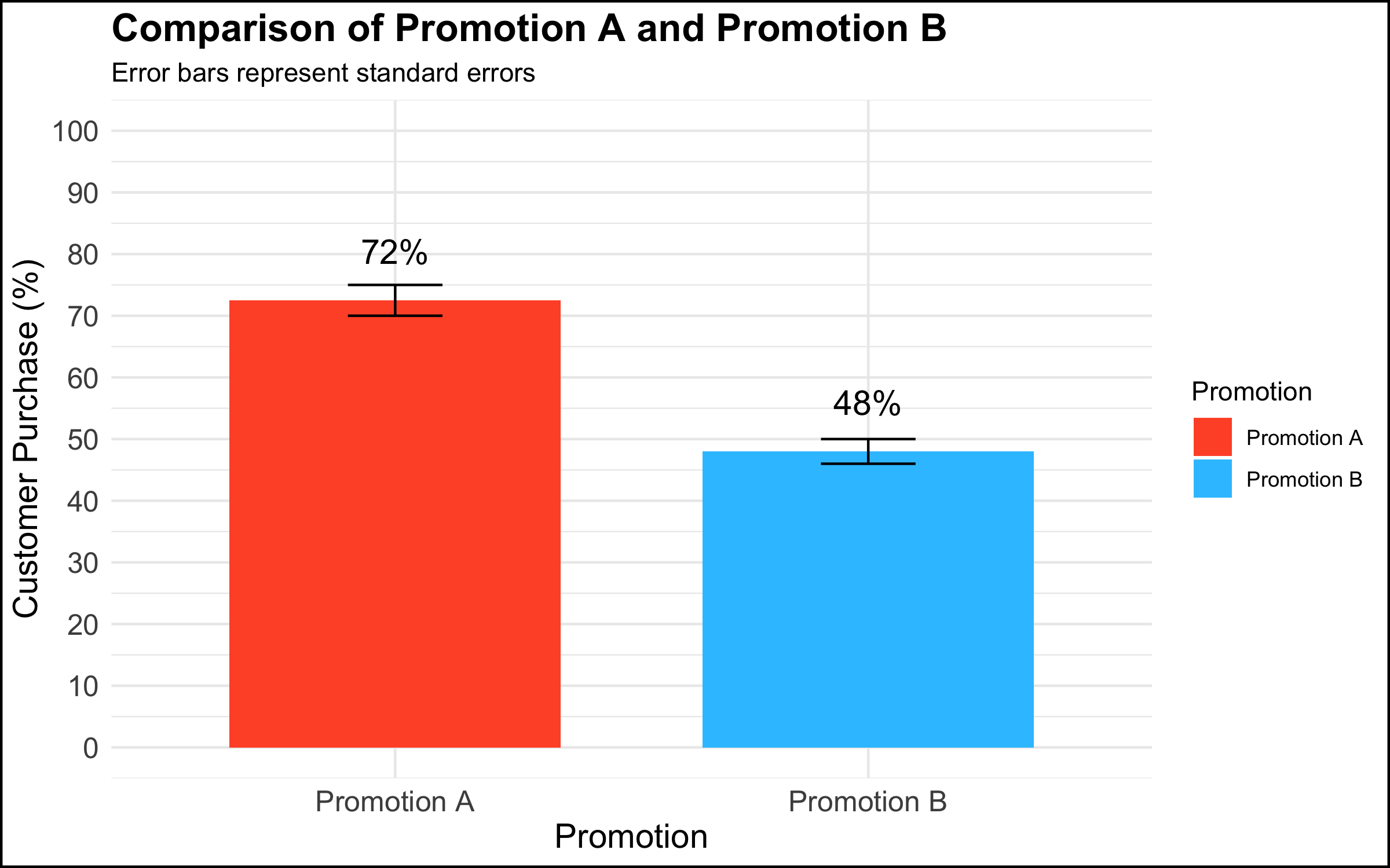
The Reaction
-
Rather than being rewarded for showing a clear and compelling data visualization that had decision implications, the executives’ response was: “This isn’t good enough.” One executive in particular insisted that they needed drill downs, for example per region, per store within region, product category within store, etc.
-
The marching orders from this meeting were to produce the additional visualizations and send them to management. However, there was no plan for following up on this additional work or any commitment for any resulting actions. The data team left the meeting with the feeling that this was just the beginning of a long and complicated cycle in which an endless series of graphs would be made, but that nothing would ever be done with them.
The Diagnosis
Why does this happen? There are at least 2 diagnoses in our opinion.
-
The first explanation assumes good intentions on the part of the management stakeholder. The simple truth is that not everyone is equally comfortable with data or with making data-driven decisions. Among some stakeholders there is a feeling that, if they had all of the information, they would be able to completely understand the situation and decide with confidence. A related belief is that more information is better (this is why organizations build an often overwhelming number of dashboards, showing splits of the data according to a never-ending series of categories). Furthermore, some decision makers want to make many local decisions – e.g. to manage each country, region, store, or individual product in its own way, though this can quickly become unmanageable.
-
The second explanation does not assume good intentions on the part of the organizational stakeholder. To executives who are used to simply going with their intuition or gut feeling, being challenged to integrate data into the decision-making process can be a somewhat threatening proposition. One strategy to simply ignore data completely is to leave the analysis unfinished by sending the data team down a never-ending series of rabbit holes while continuing to make decisions as usual.
The Solution
The solution here depends on the diagnosis of the problem.
-
If one assumes that the issue is a desire for mastery and a discomfort with numbers, a helpful strategy is to re-center the discussion on the high-level topic at hand. In the context of the graph shown above, one approach would be to say something along the lines of: “What are we trying to do here? We conducted an experiment to see whether using different types of promotions would impact our overall sales. We saw that customers who received Promotion A were 1.5 times more likely to buy the product than customers who received Promotion B. Our testing sample was representative of our customer base, and so the analysis suggests that we expand the use of Promotion A to all of our customers.”
-
If one assumes that the issue is a desire to ignore data completely and continue on with business as usual, there’s not much that you as a data professional can do to change the managerial culture and address the underlying issue. A single occurrence of such behavior could just be a fluke, but if you keep finding yourself in this position, we would encourage you to reflect on whether you are in the right place in your organization, or in the right organization at all. If all you do is chase rabbits, you will wind up exhausted, never finish anything, and your work will have no impact.
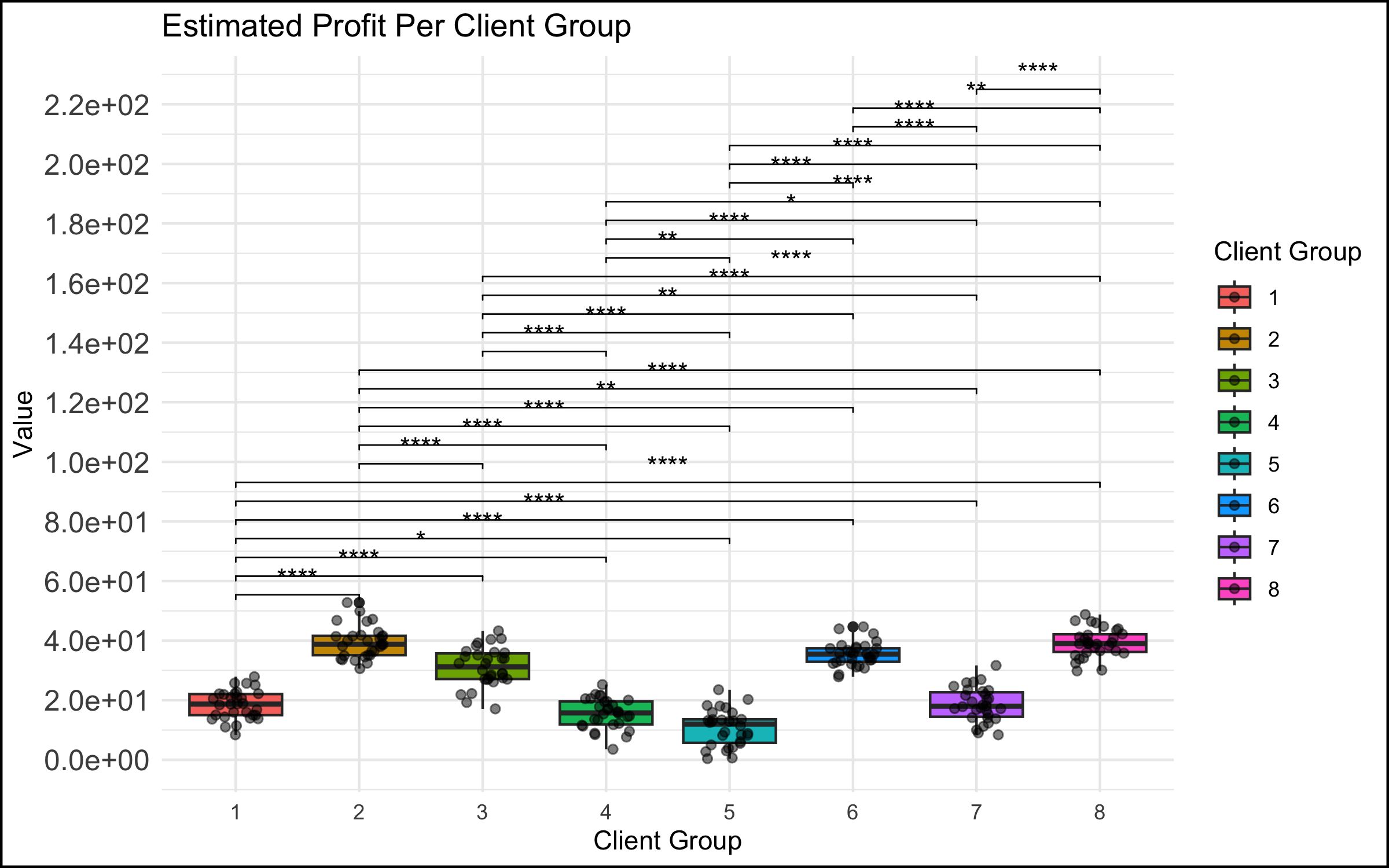
Case 3: When A Graph Leads to Stakeholder Tunnel Vision
What Happened
- In a meeting among the data science team and management, a data scientist presented a simple graph showing some patterns in the data. (The graph here is a correlation matrix of the mtcars dataset, included for illustrative purposes).

The Reaction
-
For reasons that were unclear to the data team, a manager exhibited an odd focus on a single data point and asked a great many questions about it, derailing the meeting and the higher-level discussion in the process.
-
An example of what this looked like, applied to the correlational graph above:
- “Ah so the bubble with Weight and Weight is a big blue circle. Well, this Weight score is very important because this is one of our key metrics. So why is the dot so blue? And why is it so big? And what does it mean that the Weight and Weight has one of the biggest and bluest bubbles, compared to the other ones?” (Note to the readers: the big blue circle indicates the correlation of the Weight variable with itself; the correlation is by definition 1, and explains why the bubble is big (it’s the largest possible correlation) and blue (the correlation is positive). There is nothing substantively interesting about this result.)
The Diagnosis
-
As in the case of the simple graph above, the problem might stem from discomfort on the part of a stakeholder who is not at ease with understanding data and graphs. Although this feels unnatural to many data professionals, the simple truth is that data makes many people uncomfortable. It is possible that this extreme focus on a single detail in a larger analysis reflects a desire for mastery over a topic that feels scary and uncontrollable.
-
Another potential explanation concerns the performative function of meetings in the modern workplace. In an organizational setting, meetings are not simply a neutral environment where information is given and received. Especially in larger companies, and in meetings with large numbers of participants, simply making a point or digging into a detail is a strategy some people use to draw attention to themselves or show that they are making a contribution to the discussion. (Even if the contribution is negligible or counter-productive!)
The Solution
- As described above, the recommended solution here is to take a step back and recenter the discussion. In the context of our correlation analysis above, we might step up and say – “What are we trying to do here? We are showing a correlation matrix of the most important variables, and we see that the correlations in this plot show that larger and more powerful cars get fewer miles per gallon (are less fuel-efficient). In our next slide, we show the results of a regression analysis that identifies the key drivers of our outcome metric.” And then move on to the next slide in order to continue with the story you are giving in your presentation.
Case 4: When the Data Reveal an Uncomfortable Truth
What Happened
- In a meeting with top management, a data scientist showed a simple chart of a metric by location, and made a simple observation about the pattern shown by the data – “ah, our metric is lower in Paris and Berlin vs. London.” This was a relatively simple observation, very clear from the graph, and the data scientist thought that this was some basic information that management should be aware of.
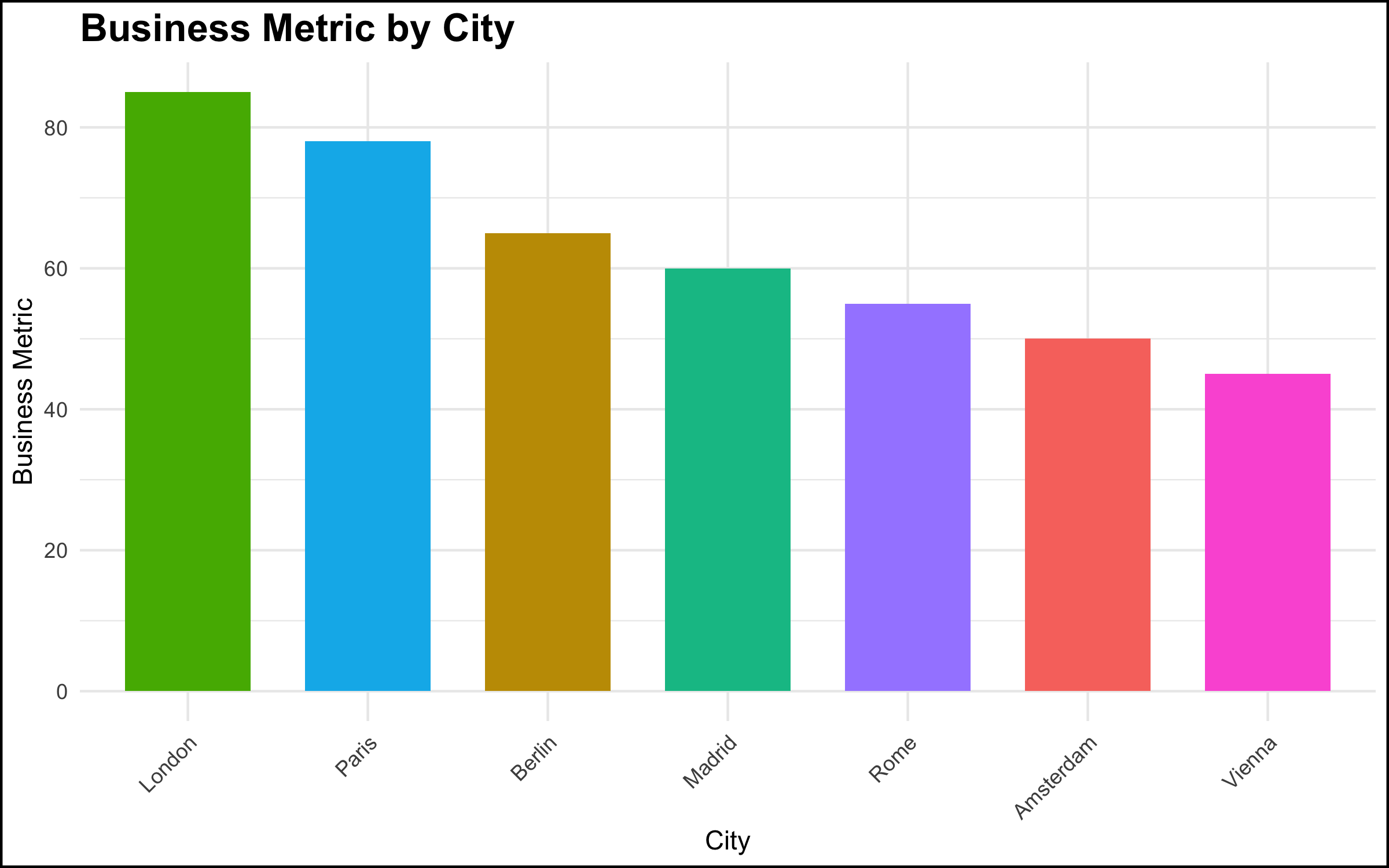
The Reaction
- The reaction on the part of the senior stakeholder, however, was explosive. There was a fair amount of yelling and shouting, not particularly related to the topic at hand. It was as if a toddler in a suit was having a meltdown. The meeting ended quickly, and the executive made it clear he did not want the project to continue or to see the data scientists again.
The Diagnosis
- The executive was aware of the situation that the data visualization revealed. However, the facts that the data made clear were problematic for the executive’s scope of responsibility. Truly addressing the issue would have been difficult if not impossible given the organizational structure and geographic footprint. Rather than acknowledge the problem and work to solve it, the most expedient solution was to “shoot the messenger.”
The Solution
- There’s not a lot that a data scientist, or even a data scientist leader, can do in these situations. Nevertheless, shouting in meetings is completely unacceptable. Our recommendation is to simply look for another job. There is enough work right now for data profiles, and you owe it to yourself to seek out a more professional organization.
Summary and Conclusion
The goal of this blog post was to describe some common non-technical problems that are encountered by data professionals while working in organizational settings. We focused here on communicating about data, and some of the many things that can go wrong when we talk about data or present the results of a data project to colleagues.
Communication in any organization can be difficult, and communication about data particularly so. Data topics can be complex, and such discussions can make people uncomfortable, or reveal facts that some stakeholders would prefer remain hidden. In many organizations, employees do not have much training or experience in data, and this often understandably leads to confusion as data projects start to be rolled out.
Our goal here was not simply to make a list of potential difficult situations, but to give you some things to think about and some solutions to try when you run into similar problems. In our view, it’s worth talking about what can and does go wrong in data projects, because we believe this work is important. It is our hope that, the more we as a field talk about problems like these, the better awareness is (among data practitioners and their stakeholders!) and hopefully the better the whole field works. There is a tremendous opportunity to do better, so let’s take it!
Coming Up Next
Our next blog post will focus on interpersonal issues that can pose problems in data projects. Stay tuned!
Post-Script: R Code Used to Produce the Graphs Shown Above
This is a live blog of the final lecture of the 2025 edition of my graduate machine learning class “Patterns, Predictions, and Actions.” A full Table of Contents is here. I tried to summarize my semester reflections in class on Thursday, but found my thoughts haven’t quite settled yet. I’m hoping a week of posting will help me sort through it.
My GSIs (one in particular) gave me a lot of guff about how the homework was too easy this semester. My response is that the theoretical foundations of the course are still too weak for me to pose hard math questions in good faith. Yes, there are difficult mathematical problems in finding the optimal constants for certain learning-theoretic bounds. But finding constants for theories that give bad advice in practice is a waste of everyone’s time. In machine learning, we learn more from social analysis than functional analysis, and it’s hard to write problem sets on sociology.
The theory in machine learning is frustratingly less mathematical than that of other fields of information engineering. For example, consider mathematical optimization, which I taught last fall. There, you begin with a mathematical modeling language. If you believe that you have a problem that can be written in this language, optimization provides algorithms to find the solution. If you can’t write your problem in that language, you’ll need to try something else.
You might think machine learning works that way too. If we believe we have a population in which a certain variable is well approximated by a parametric function of the other variables, then sure, we can look into algorithms to estimate that function via random sampling from the population. However, we rarely ever believe in this parametric assumption in applied machine learning. This is where we become untethered from the mathematics. In almost every problem that people care about, we simply don’t know the functional relationship connecting these quantities. Because if we did know it, we wouldn’t be using machine learning in the first place.
I like to illustrate this with two extreme cases:
I believe that there is a computer program that can tell whether a string of bits has an even or odd number of ones. I can write this program in a single line of Python. I don’t use machine learning.
I believe there is a computer program that can identify animals in images. I have no idea how to write that computer program. I turn to machine learning.
In machine learning, the price of admission is a belief that pattern recognition is possible and the conviction that it’s too hard to write a function describing these patterns from first principles. Generalization is an axiom, not a theorem. It would be nice if we could say one algorithm is better than another at finding these prediction functions, but we don’t have theory for that. Instead, we have to look to engineering “best practice” for what to do next.
Am I saying that every machine learning course has to have a few weeks on science studies? Yes I am.
Of course, this is frustrating as all hell to computer science students who are taught that you just type incantations into Jupyter notebooks and conjure up pure logical positivism. Machine learning has a recipe book, but, unlike when I’m teaching an undergraduate course in algorithms, I can’t justify much of it at all.
I know that I can approximate arbitrary nonlinear patterns as a composition of simple, componentwise nonlinear functions and linear maps (what we call neural networks). I know that I can arrange data streams into arrays that respect certain local consistency properties, thinking of text as sequences of tokens and images as spatial arrays of patches. I can compose these basic primitives to construct a bunch of different candidate prediction functions. I can use numerical search to find the linear maps in the resulting functional expression.
This set of weakly specified building blocks begets a zoo of methods. But we can only tell stories for why we’d prefer one over another. Random Forests, CNNs, RNNs, and Transformers are all potentially useful to get your number to go up, but they aren’t fundamental in any sense. There are some architectures that people get excited about for a while, and they yell about how awesome they are. Then some new architecture becomes exciting, and they yell about that. People build the next cool thing on the last cool thing. They tend not to emphasize how data is fundamental, and how it’s essential to set up your ETL pipeline in precisely the right way. But those pesky details are easy enough to find if you look through the various open-source machine learning repositories. And so machine learning continues, one pull request at a time.
This organic process is fine! But I don’t think you can explain anything about it with large deviation inequalities or functional analysis. How can I know which method is best? I check my answer on some leaderboard.
I’ve been trying to figure out how best to teach this in context. Our machine learning practices make it impossible to disentangle technical innovation from technical debt. I don’t want to prove theorems about some widget that is currently widely deployed because maybe it won’t be used next week. Some components are vestigial structures left behind after a frenzied series of paper deadlines and investor calls. Which structures? I can’t tell you.
On the other hand, machine learning has some shockingly robust practices that other fields should emulate. The train-test paradigm is fascinating. How can I know which method is best? I check my answer on some leaderboard. Despite statistical arguments declaring it fundamentally flawed, the culture of competitive testing on benchmarks has driven and still drives the engine of what the field defines as progress. We still can’t explain much about why it works as well as it does. We don’t have compelling theories for why benchmarks don’t go stale as they saturate, or why we see the patterns we see in empirical performance on these benchmarks. The social patterns here are fascinating, and they should be taught more explicitly in machine learning courses.
Although some argue that we need to move beyond the benchmarking paradigm, I would counter that the benchmarking paradigm defines the field. Believe that pattern recognition is possible. Specify your metric at the population level. Gather two samples representative of this population and use one for play and one for benchmarking, trying to maximize your metric. Once you get bored with the benchmark, make a new one. That’s machine learning in a nutshell. In practice, machine learning sociology is all we need.
Your ChatGPT subscription is subsidising the terraforming of Earth.
Not metaphorically. China’s solar overbuild is crashing electricity prices toward zero. AI demand absorbs the surplus. When power is essentially free, we manufacture fuel from thin air instead of drilling for it.
Solar has become a deflationary technology, following the same exponential cost curves that made computing ubiquitous. In 2024, China installed more solar capacity in a single year than the United States has installed in its entire history.1 The world added roughly 600 GW last year, equivalent to installing Australia’s entire grid every few months.
None of this was planned. More than $130 billion poured into China’s solar industry, driven by what industry leaders have called “blind investments and disorderly financial lending.”2 China now holds over 80% of global manufacturing capacity across the entire supply chain, with utilisation rates hovering around 50-60%. The industry is producing far more than the market can absorb. Solar hardware costs have collapsed to near $0.10 per watt and continue falling. We have left the era of energy scarcity and entered the era of manufactured energy.
Into this glut arrives the hungriest electricity buyer in history.
Grid connections take seven years while AI scaling laws operate on months. Tech giants are building dedicated solar installations behind the meter, bypassing the glacial pace of grid development. AI data centre demand is projected to double by 2030, potentially reaching a Japan-sized energy footprint. But unlike households or hospitals, AI loads are flexible. Workloads can shift across hours or days. Compute can relocate to wherever energy is cheapest. Training runs are price-sensitive and will chase arbitrage. This makes AI the perfect absorber of surplus daytime solar. Solar is becoming the world’s cheapest input precisely as AI becomes the world’s hungriest buyer.
To run a data centre 24/7 on solar power, you must overbuild capacity by four to five times.3 For roughly eight hours each day during peak sun, these facilities generate gigawatts of excess electricity that the batteries cannot hold and the servers do not need.
Turning air and water into natural gas is thermodynamically possible but economically absurd at normal electricity prices. Capture CO2 from the atmosphere, electrolyse water into hydrogen, combine them to produce methane. The chemistry has been understood for over a century, but it requires so much electricity that it only makes sense when power costs around $10 per megawatt hour.
That “waste” energy from AI solar farms is exactly that free electricity.
Terraform Industries has built container-sized units that do precisely this.4 Instead of curtailing that midday spike, we feed it into machines that convert sunlight and air into pipeline-grade natural gas. Input: sunlight plus air. Output: methane. Carbon becomes a circular industrial input rather than a pollutant extracted from underground. The synthesis plants soak up whatever the batteries cannot store.
Once electricity becomes essentially free during daylight hours, we stop drilling for fossil fuels and start manufacturing them from air. Desalination becomes trivial. Synthetic ammonia production gets cheap, shifting the cost structure of global food. Plastics become carbon-neutral.
Energy independence stops being about who controls oil reserves and starts being about who has land and sunlight. The Middle East of the future is Nevada, Australia, and Namibia.
This reframes the entire conversation about AI power usage. The real question is whether we can generate electricity cleanly. The answer is becoming yes, in such abundance that we will need to invent new uses for the surplus.
For most leaders, this feels distant. Most of us are not building hyperscale data centres. But the second-order effects matter.
Watch energy costs in cloud pricing. As electricity becomes the dominant cost in AI inference, providers will increasingly price by consumption. The ones who figure out solar arbitrage will offer cheaper inference. This will show up in your bills before you understand why.
Watch local AI. When running models locally becomes cheap enough, the economics of cloud versus on-premise shift. The line is moving. Keep an eye on where it lands.
Prepare for abundance thinking. The interesting question is shifting from “how do we afford AI?” to “what becomes possible when AI is essentially free?” LLM costs per token have dropped 100x in two years.5 Planning for scarcity when abundance is arriving is the wrong bet. The companies that win will be the ones who figure out what to build when the constraint disappears.
China’s industrial policy is creating the oversupply. AI is arriving to absorb it. Synthesis technology makes the excess useful. The path to addressing climate runs through extreme abundance, and your AI usage is part of what makes it viable.

-
China added 329 GW of solar capacity in 2024, accounting for 55% of global installations. The world added a record 597 GW total, bringing global capacity to 2.2 TW. Sources: SolarPower Europe Global Market Outlook 2025-2029, BNEF Global PV Market Outlook. ↩
-
Gao Jifan, chairman and CEO of Trina Solar, identified “blind investments, excessive local government efforts, and disorderly financial lending” as key drivers of overcapacity. China now accounts for over 80% of global polysilicon, wafer, cell, and module manufacturing capacity. BNEF expects overcapacity to persist through at least 2027. Sources: Wood Mackenzie analysis of China’s 2024 PV manufacturing guidelines, BNEF Energy Transition Supply Chains 2025. ↩
-
To guarantee 24/7 power from solar requires overbuilding capacity significantly to charge batteries for nighttime operation. The exact ratio depends on location and storage costs, but 4-5x is a reasonable planning assumption for most high-sun regions. See Casey Handmer’s analysis in We’re Going to Need a Lot of Solar Panels. ↩
-
Terraform Industries builds modular synthetic fuel plants optimised for intermittent power sources. In April 2024 they delivered carbon-neutral pipeline-grade synthetic natural gas to utility partners at 99.4% methane purity. Their thesis is that solar electricity below $10/MWh makes atmospheric carbon capture and fuel synthesis economically competitive with extraction. See Casey Handmer’s Radical Energy Abundance for the detailed analysis. ↩
-
GPT-4 cost $36 per million tokens at launch in March 2023. GPT-4o mini now costs $0.15 per million input tokens. The Stanford AI Index 2025 reports inference costs for GPT-3.5-class models fell 280-fold between 2020 and 2024. See DeepLearning.AI’s analysis of falling token prices. ↩
If the part of programming you enjoy most is the physical act of writing code, then agents will feel beside the point. You’re already where you want to be, even just with some Copilot or Cursor-style intelligent code auto completion, which makes you faster while still leaving you fully in the driver’s seat about the code that gets written.
But if the part you care about is the decision-making around the code, agents feel like they clear space. They take care of the mechanical expression and leave you with judgment, tradeoffs, and intent. Because truly, for someone at my experience level, that is my core value offering anyway. When I spend time actually typing code these days with my own fingers, it feels like a waste of my time.
— Obie Fernandez, What happens when the coding becomes the least interesting part of the work
Tags: careers, ai-assisted-programming, generative-ai, ai, llms
The Normalization of Deviance in AI
This thought-provoking essay from Johann Rehberger directly addresses something that I’ve been worrying about for quite a while: in the absence of any headline-grabbing examples of prompt injection vulnerabilities causing real economic harm, is anyone going to care?Johann describes the concept of the “Normalization of Deviance” as directly applying to this question.
Coined by Diane Vaughan, the key idea here is that organizations that get away with “deviance” - ignoring safety protocols or otherwise relaxing their standards - will start baking that unsafe attitude into their culture. This can work fine… until it doesn’t. The Space Shuttle Challenger disaster has been partially blamed on this class of organizational failure.
As Johann puts it:
In the world of AI, we observe companies treating probabilistic, non-deterministic, and sometimes adversarial model outputs as if they were reliable, predictable, and safe.
Vendors are normalizing trusting LLM output, but current understanding violates the assumption of reliability.
The model will not consistently follow instructions, stay aligned, or maintain context integrity. This is especially true if there is an attacker in the loop (e.g indirect prompt injection).
However, we see more and more systems allowing untrusted output to take consequential actions. Most of the time it goes well, and over time vendors and organizations lower their guard or skip human oversight entirely, because “it worked last time.”
This dangerous bias is the fuel for normalization: organizations confuse the absence of a successful attack with the presence of robust security.
Tags: security, ai, prompt-injection, generative-ai, llms, johann-rehberger, ai-ethics
Next Page of Stories